INTRO
Welcome to the Marlena’s brand guidelines. They outline the visual and verbal identity of our brand. In the end guidelines are just that, a guide. Use your best judgement and reference this document as a starting point.
BRAND VALUES
Curated / Crafted / Creative
Brand Summary
-
• A Memorable + Artfully Curated Experience
• Welcoming + Community-Focused Approach
• High-Quality Seasonal Ingredients
-
• Approachable + Friendly + Neighborly
• Passionate + Committed + Caring
• Honest + Authentic
-
• Intimidating / Pretentious
• Agressive / Argumentative
• “Justy Trendy” / Superficial
• Generic
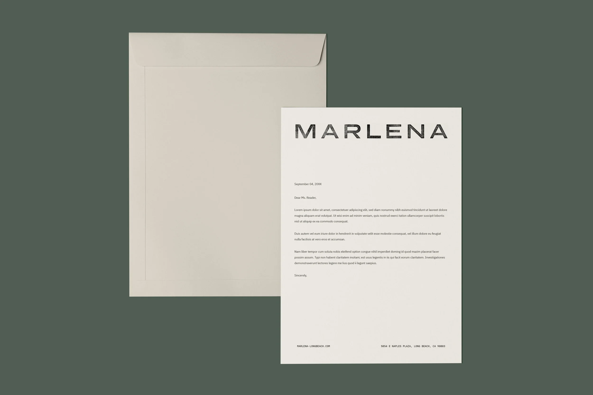
LOGOS + WORDMARKSOur logo is our single most valuable asset. It’s what identifies us, gives us authority, And helps build trust.
It is imperative to use our branding consistently across all channels. To preserve the integrity of the brand, avoid any alterations to our logos and sub-marks.
wordmark Lockup
-
Marlena’s lockup should be used when audience is interacting with the brand for the first time ensuring the restaurant is presented in full context.
Marlena’s wordmark set in Presicav. While the wordmark uses our primary typeface, it was hand-kerned and weight-adjusted so the vector version should be used in all cases.
-
The logo has been carefully crafted to read well, even at small sizes. There is no limit at large scale, but be careful at smaller sizes. If legibility is an issue, it’s too small.
Recommended minimum size is 20 pixels for screen, and 1/4 inches in print.
-
To ensure consistent brand registration, the logo must maintain a clear area of space equal to its height. This is called clear pace.
Clearspace for the wordmark is calculated based on the height and width of the letter “M” and is relative to how the wordmark is displayed in all sizes.
• Minimum Logo Width - 2”
• 2” is the safest minimum size.
• If a smaller logo is needed, please use submark.
wordmark alternative (stamped)
-
Marlena’s primary logo is a wordmark set in Presicav. While the wordmark uses our primary typeface, it was hand-kerned and weight-adjusted so the vector version should be used in all cases.
-
The logo has been carefully crafted to read well, even at small sizes. There is no limit at large scale, but be careful at smaller sizes. If legibility is an issue, it’s too small.
Recommended minimum size is 20 pixels for screen, and 1/4 inches in print.
-
To ensure consistent brand registration, the logo must maintain a clear area of space equal to its height. This is called clears pace.
Clearspace for the wordmark is calculated based on the height and width of the letter “M” and is relative to how the wordmark is displayed in all sizes.
• Minimum Logo Width - 2”
• 2” is the safest minimum size.
• If a smaller logo is needed, please use submark.
wordmark -
Marlena’s primary logo is a wordmark set in Presicav. While the wordmark uses our primary typeface, it was hand-kerned and weight-adjusted so the vector version should be used in all cases.
-
The logo has been carefully crafted to read well, even at small sizes. There is no limit at large scale, but be careful at smaller sizes. If legibility is an issue, it’s too small.
Recommended minimum size is 20 pixels for screen, and 1/4 inches in print.
-
To ensure consistent brand registration, the logo must maintain a clear area of space equal to its height. This is called clears pace.
Clearspace for the wordmark is calculated based on the height and width of the letter “M” and is relative to how the wordmark is displayed in all sizes.
• Minimum Logo Width - 2”
• 2” is the safest minimum size.
• If a smaller logo is needed, please use submark.
CAFE signature (Stamped)
-
To be used when referencing cafe only.
-
The logo has been carefully crafted to read well, even at small sizes. There is no limit at large scale, but be careful at smaller sizes. If legibility is an issue, it’s too small.
Recommended minimum size is 20 pixels for screen, and 1/4 inches in print.
-
To ensure consistent brand registration, the logo must maintain a clear area of space equal to its height. This is called clears pace.
Clearspace for the wordmark is calculated based on the height and width of the letter “M” and is relative to how the wordmark is displayed in all sizes.
• Minimum Logo Width - 2”
• 2” is the safest minimum size.
• If a smaller logo is needed, please use submark.
Always ensure there is enough contrast between the background and the logo. For more color guidance, see color section.

Icon Our icon is the simplest form of identification for our brand.
-
Marlena’s primary logo is a wordmark set in Presicav. While the wordmark uses our primary typeface, it was hand-kerned and weight-adjusted so the vector version should be used in all cases.
-
The logo has been carefully crafted to read well, even at small sizes. There is no limit at large scale, but be careful at smaller sizes. If legibility is an issue, it’s too small.
Recommended minimum size is 20 pixels for screen, and 1/4 inches in print.
-
To ensure consistent brand registration, the logo must maintain a clear area of space equal to its height. This is called clears pace.
Clearspace for the wordmark is calculated based on the height and width of the letter “M” and is relative to how the wordmark is displayed in all sizes.
• Minimum Logo Width - 2”
• 2” is the safest minimum size.
• If a smaller logo is needed, please use submark.
-
The secondary logo is what we call “The Icon”. The Icon is primarily used in situations with minimal horizontal space. The Icon and the Wordmark are not used in combination.
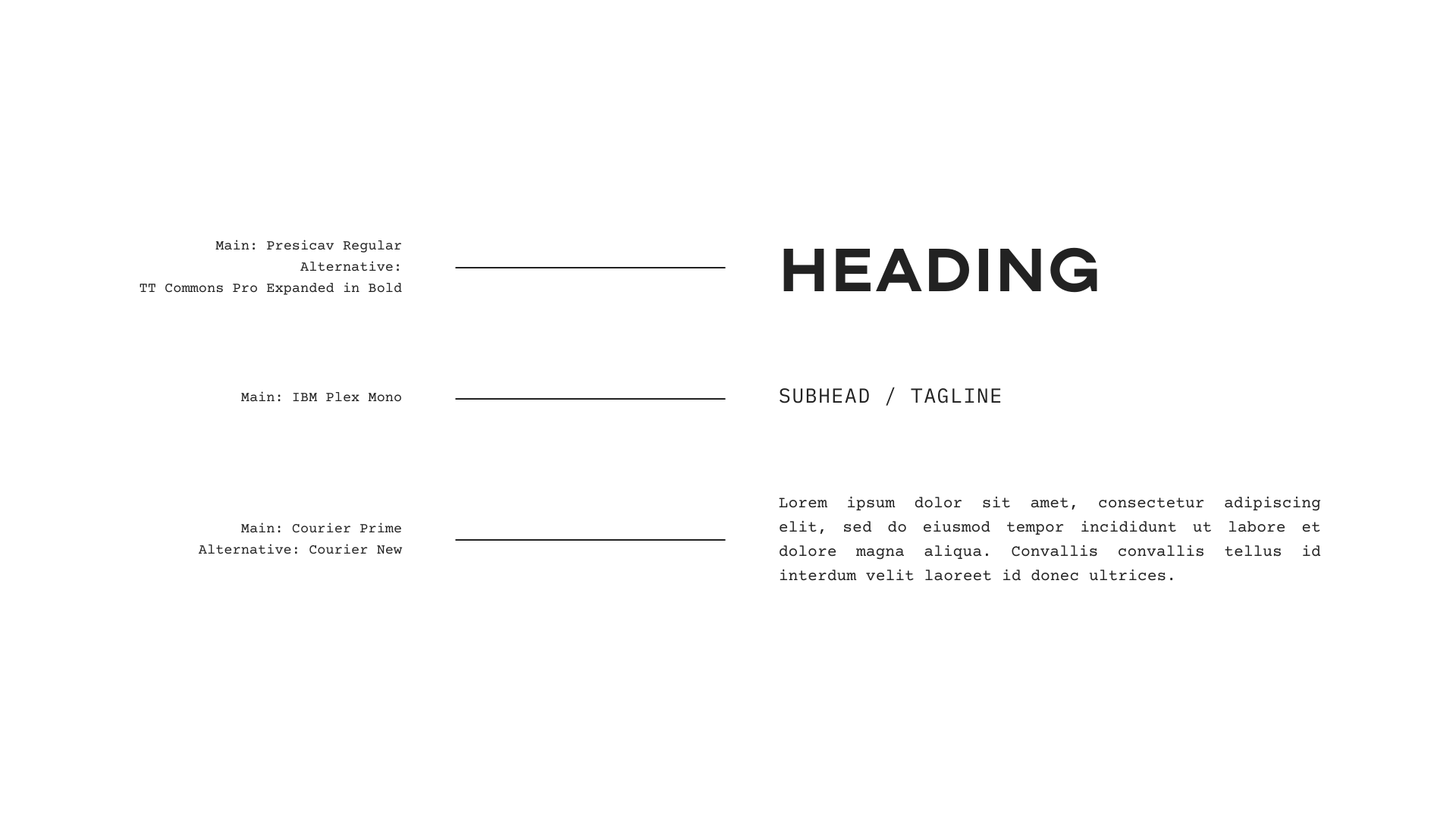
TYPOGRAPHYOur fonts each have a special, one-of-a-kind personality.
A fresh combination of sans-serif, and mono-spaced fonts are flexible enough to express our unique brand voice.
colorColor is an important tool we use to convey our personality and encourage brand recognition.
Our secondary palette is meant to be introduced sparingly in order to have a clean balance and hierarchy amongst all of our brand elements.


imagery
IMAGERY DO'S + don’ts
-
• Showcase Marlena in a welcoming + approachable manner.
• Avoid posing or staged scenarios.
• Focus in inspirational scenarios that help illustrate a broader story.
-
• Employ natural, well-lit environments.
• Stay to true to tones. Avoid overly processed editing including filters + B&W processing.
-
• Feature both the space + menu offerings.
• Add in human touch when possible (i.e. hands)

applicationEvery touchpoint within our customer experience matters. Our tangible printed collateral is no different.
While our design may be simple, it’s impactful. Ensure high quality standards when it comes to production throughout printed collateral. Sustainable options are always encouraged.